As Hangul Day approaches, Koreans celebrate the creation of their unique writing system — a symbol of cultural identity and national pride. Today, Hangul has evolved beyond a simple alphabet to become a global design and branding element.
In Los Angeles, Hangul is increasingly used in mainstream marketing as the spread of K-pop, K-beauty, and other K-culture trends exposes more people to Korean aesthetics. Businesses are incorporating Hangul into logos and product packaging to stand out visually and reinforce cultural connections.
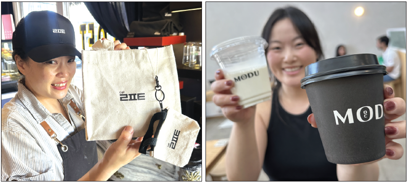
At the Koreatown café Cafe Loft, the brand uses the Hangul consonants “ㄹㅍㅌ” as its logo. The minimalist design creates a modern and refined look that feels fresh to non-Korean customers while instilling pride in Korean patrons. “The inspiration came from the Korean language exchange meetings we host every Saturday,” said Semi Choi, the café’s owner. “Hangul design itself draws attention while expressing the identity of Koreatown.”
In Fullerton, Nasung Sool Co. is another example of Hangul-centered branding. The name “Nasung,” derived from the Chinese characters for Los Angeles, takes on a new emotional tone when written in Hangul. Its soju and makgeolli (traditional rice wine) bottles feature Hangul labels, and the logo combines the English “NASUNG” with the consonants “ㄴㅅ,” emphasizing its Korean heritage and philosophy of preserving tradition through design.
The Modu Café in Highland Park also uses a Korean word for its name — “Modu,” meaning “everyone.” The logo simplifies the word to the consonants “ㅁㄷ,” enhancing visual impact. Manager Yoonji Jang said, “Many customers ask about the meaning of the letters, saying they look like the alphabet ‘OC.’ That small conversation itself becomes part of our marketing.”
A customer, Angela, 33, added, “Some stores have good food but hard-to-remember names. ‘Modu’ is easy to recall and looks cute as a logo.”
Experts note that Hangul’s rhythmic simplicity makes it easy to pronounce and visually appealing to non-Korean audiences. Its integration into branding blends emotional resonance, cultural identity, and innovative design.
Hangul has grown into more than an alphabet — it now represents creativity, trust, and authenticity within global K-brands. Marketers highlight its success factors as cultural authenticity, visual uniqueness, emotional connection, and adaptability in global markets.
Created with the idea of being “easy for everyone to learn and use,” Hangul continues to embody that spirit today — bridging cultures through design and communication.
This story is the first of a three-part series on Hangul branding in LA.
BY HOONSIK WOO [woo.hoonsik@koreadaily.com]


